Author


Tola Ore-Aruwaji
Developer Relations Engineer
In this post, I will walk you through creating and using dashboards in Axiom to easily visualize, monitor, and share your data.
Prerequisites
For this tutorial, you will need:
When to Use Dashboards
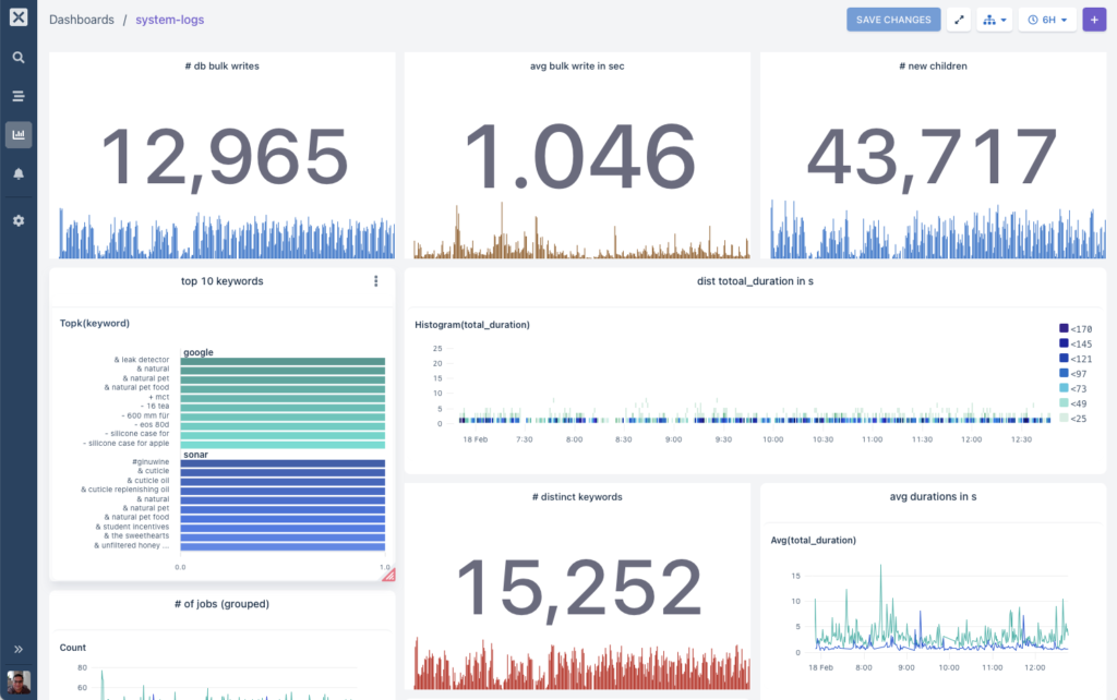
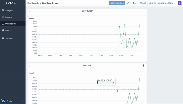
Dashboards consist of Queries which can individually access any dataset the user has access too. Each query can visualize one or more charts, which are grouped together to create the dashboard.
Users have full control over the size and position of each query and the charts they produce. There is also a special chart called “Statistic”, which displays a number + bar chart in a large detail.
Here are some of the uses for dashboards:
- Visualize different datasets in one place to get an overview across multiple streams of data.
- Group collections of queries that help identify and diagnose common issues quickly when problems occur.
- Share an overview of performance or usage to other members of your team.
- As a shared workspace to build and test queries with team members.
Creating a new dashboard
- In Axiom, click on Dashboards
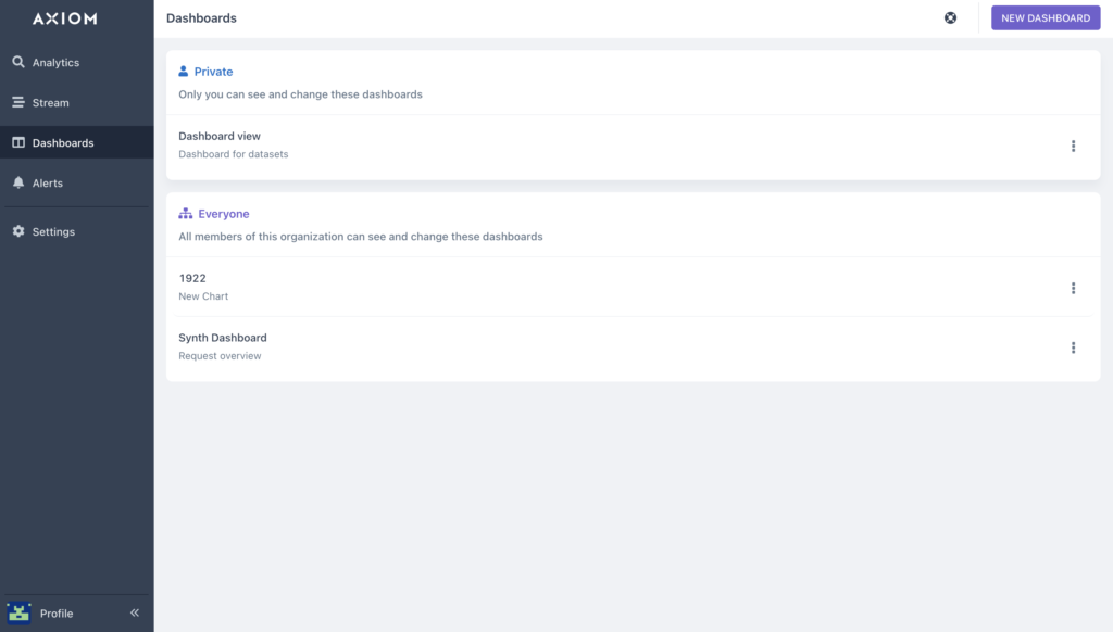
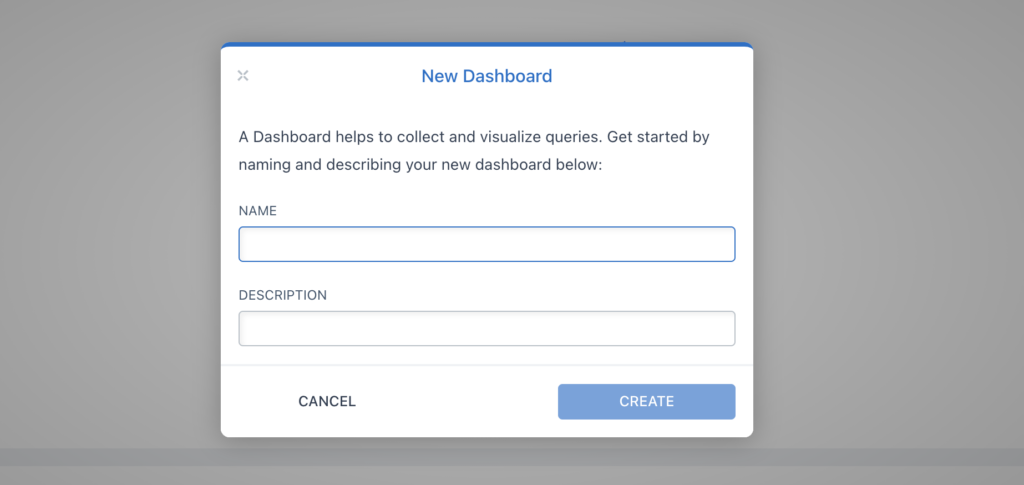
- Select NEW DASHBOARD – you’ll see a dialog that asks you for the name and a description of your new dashboard:
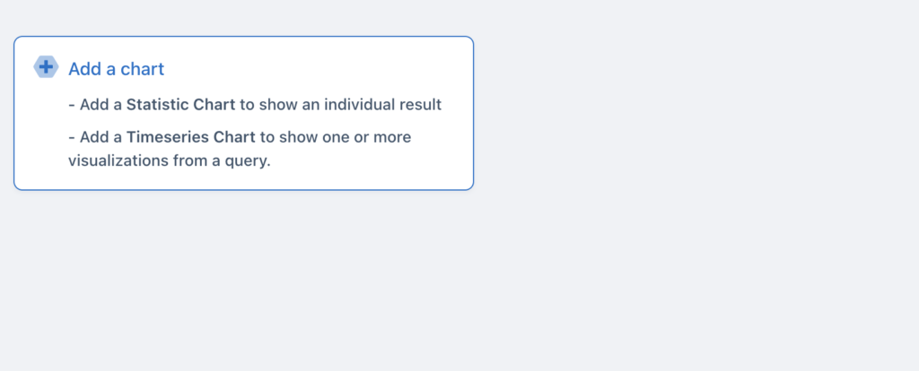
- After creating the Dashboard, you will see the (+) button this will enable you to add your first charts to your dashboard. Click on it to build your first query.
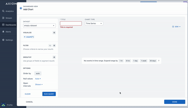
- To create a new Query for your Dashboard, click on the (+) sign at the top left corner. When you do so, the edit query slide-out dialog box will appear to begin the steps of creating queries for your Dashboard experience.
-
Choose your dataset, you want to query
-
Choose the specific visualization (avg, sum, count, etc) to see charts:
- After creating your first Query in your Dashboard, you can also add more datasets and aggregations to your existing dashboards. This lets you visualize all queries in a structured view.
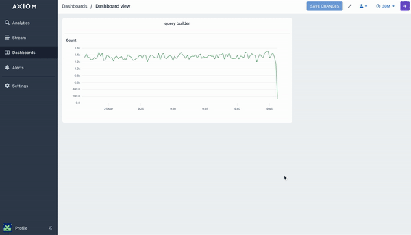
When you are done adding queries to your dashboard, select the Save Dashboard button in the toolbar to save your changes.
- To access the Dashboard settings, select the icons at the top right corner of the dashboard which let you:
-
Share your dashboard views with everyone on the team.
-
Choose your specific time rate and create a custom time range for a particular or all queries in an organized widget display.
-
View your dashboard on a whole screen on your local machine, shared monitor, or Tv.
And there we have it! That’s it. Done. Your dashboard has now been created on Axiom.
From here, you can now add more queries and get visualization from different aggregations and also explore what else Axiom can do!
You can learn more about Axiom in the docs. Happy Logging!